 I took this shot only today. Out in the nearby countryside, enjoying gorgeous sunshine, it really seemed that less really was more. So I resorted to a technique I’ve discussed before: using the concept of negative space to make a statement. This says SPRING!
Tag Archives: negative space
My Sunday Photo: 11 September 2016
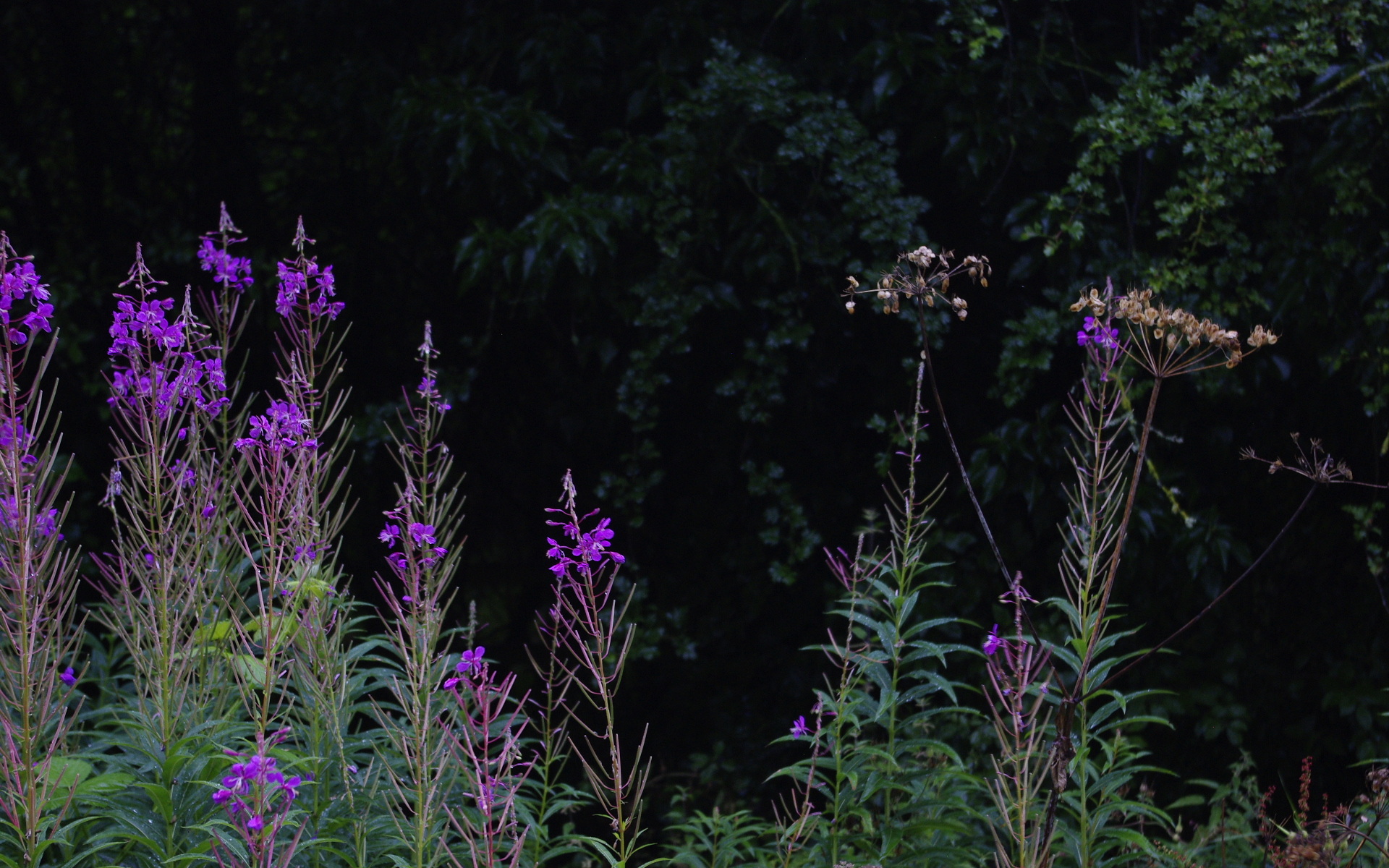
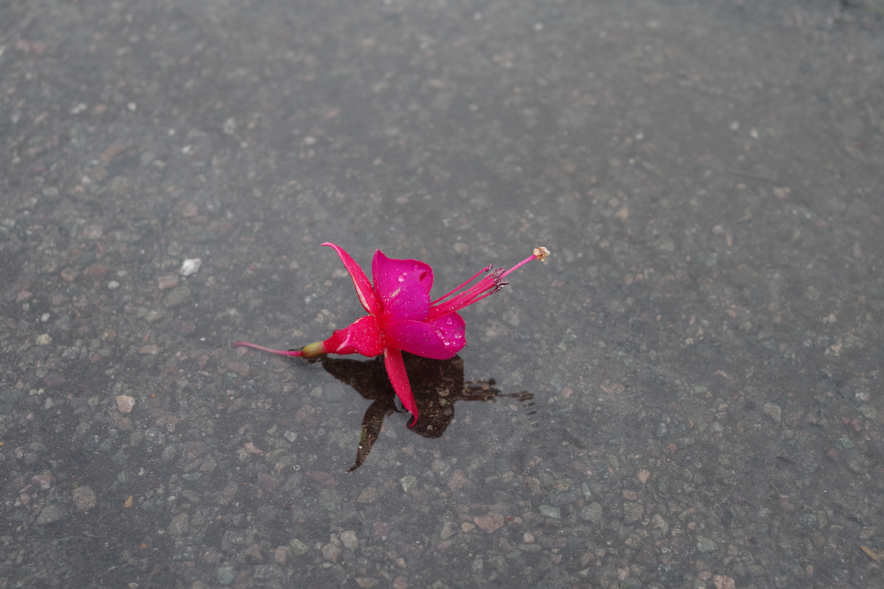 OK… So today (Saturday) was the day of the local flower show. This caught my eye as I stepped out of my car. I’ve given you the whole image, as I took it – this isn’t cropped. I think the negative space adds impact. Somehow, what I saw seemed strangely symbolic of modern life; one solitary fallen,but beautiful bloom left abandoned in the hustle and bustle of setting up the exhibits. A strange poignancy – what do you think?
My Sunday Photo: 31 July 2016
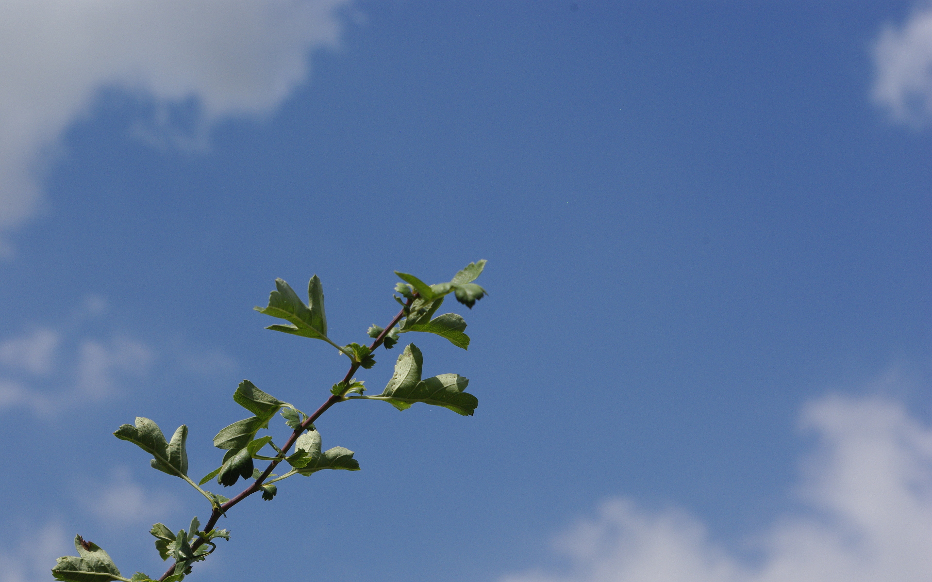
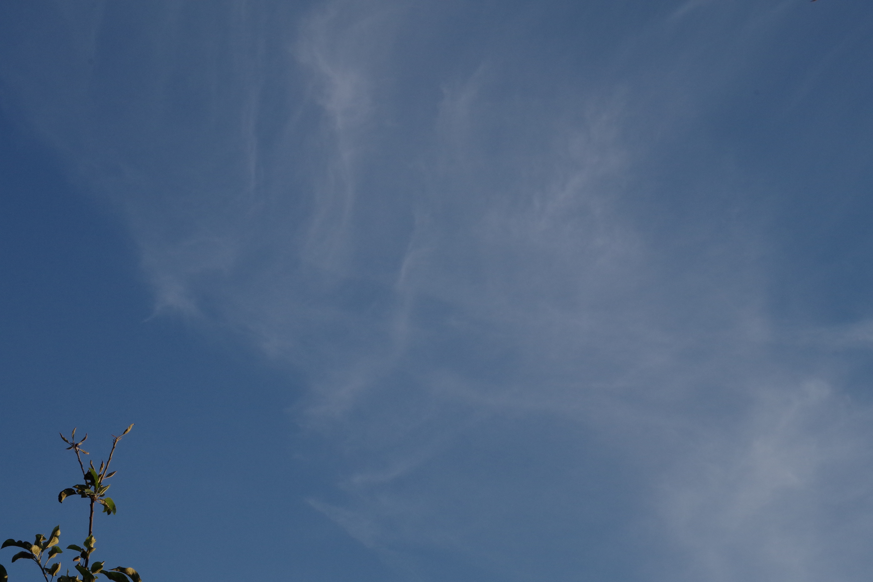 This week, I wanted something that said something about my day on Saturday. Well, where I was, on 30 July 2016, nothing amazing happened. But, if we look at nature and the world around us, life need never be boring. So in this shot, I used the concept of ‘negative space’ to symbolise summer – the top branch of an apple tree, reaching into a vast clear sky, with just a few smeary clouds at high altitude. Looking up at cloudscapes of all kinds is a marvellous way to relax, yet sharpen your power of observation at the same time!
‘Filling the frame’ – the opposite photo technique – is also one I use and love a lot, but the ‘message’ is different, yes?
My Sunday Photo: 20 September 2015
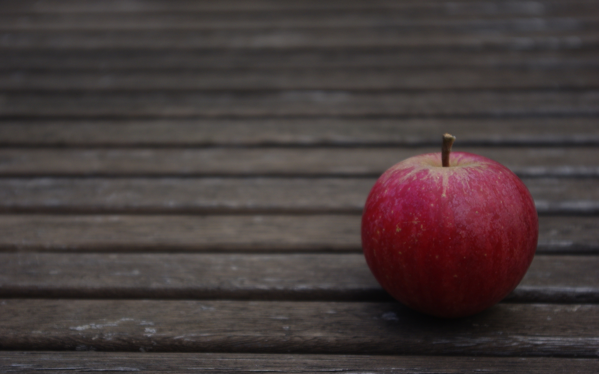 This shot is another foray into the idea of ‘negative space’ where a subject sits in a large background area. I loved the colours in this home-grown apple, but didn’t want to just fill the frame with it. The dark slats of this garden table make a contrast, illustrating two concepts connected with autumn: fruitfulness, but also, sometimes, a lot of dullness. This seemed to work for me.
Photo Composition Challenge – Part One
This is the first section of my response to the composition challenge set up by Emma Davies, here. I’ll say right now that these photos might not be be most intrinsically interesting in terms of subject matter, but the idea is to make a point in each one, which might come in handy, another time – click on any image to enlarge it. Here we go with the first ten concepts:
 1. VIEWPOINT
An interesting viewpoint can make a common subject more interesting. Here, we see the evening light catch the underside of these leaves.
 2. FRAMING
Using an appropriate object to frame the main area of the subject will sharpen the viewer’s attention.
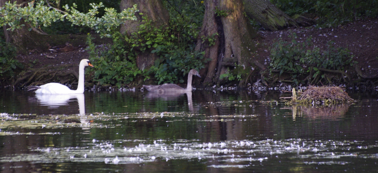
 3. NEGATIVE SPACE
A small contrasting subject in a large plain or simple (but relevant) background can convey an idea to the viewer. I’m just capturing the concept of summer, here; a close-up shot of the piece of hawthorn wouldn’t do this.
 4. DIAGONALS
Diagonal lines or boundaries can help put punch and interest into a simple image.
 5. RULE OF THIRDS
Positioning key sections of the subject, or the boundaries between them, approximately one third of the distance from the top, bottom, or one side of the frame will help the image to look ‘right’. A bit of a black art, this one, but it works!
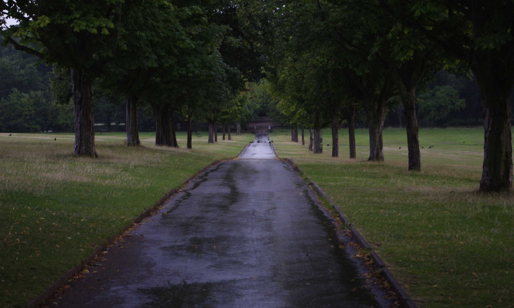
 6. LEADING LINES
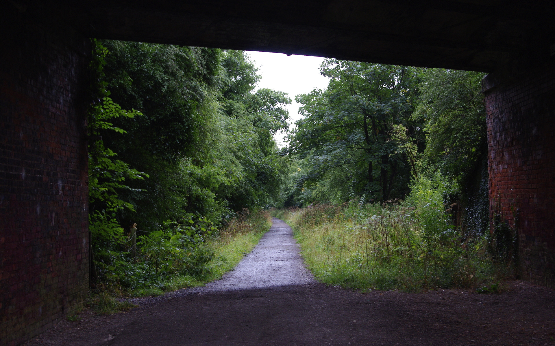
A pleasing effect results from the arrangement where naturally-occurring lines lead the eye to an important part of the subject. Here, the pathway takes us to the archway with ornate detail above. Besides such obvious instances in architecture and landscapes, parts of subjects in nature, such as the wings of a bird, can produce this effect.
 7. SYMMETRY
This is a powerful tool for adding intrigue to a simple subject. Reflections are a personal favourite of mine, but of course, architecture and manufactured articles can provide great examples.
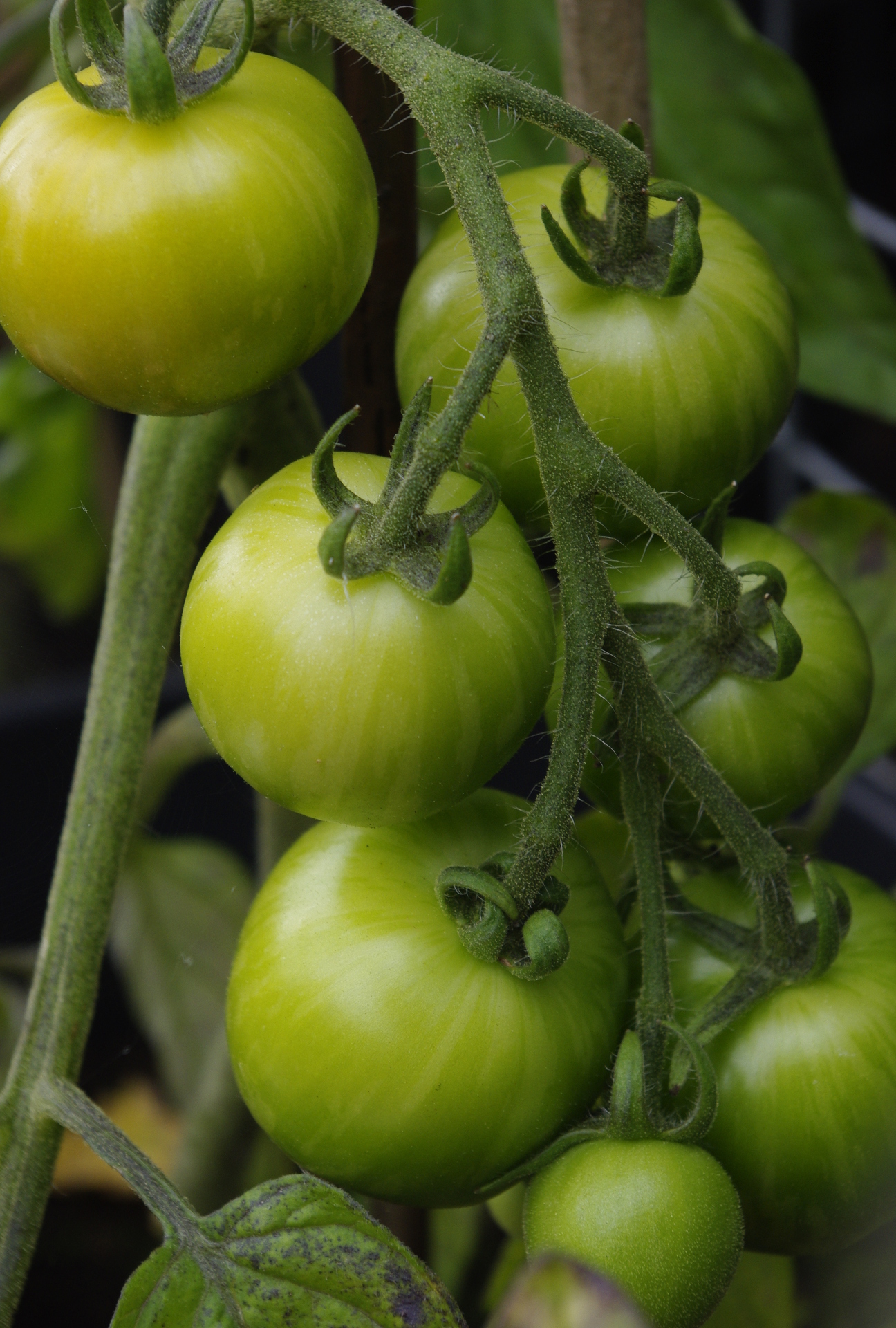 8. FILL THE FRAME
Sometimes, one smallish subject is all you want to capture; why include anything else? Fascinating details will be all the clearer, and there will be no distractions.
 9. TRIANGLES
Here, we may be considering the actual shape of a subject, the shape of one of more viewed areas (as here) or the arrangement and layout of several entities. Any of these will hold the attention, especially if combined with other interesting effects. Here, a shower of rain on the path has added that difference.
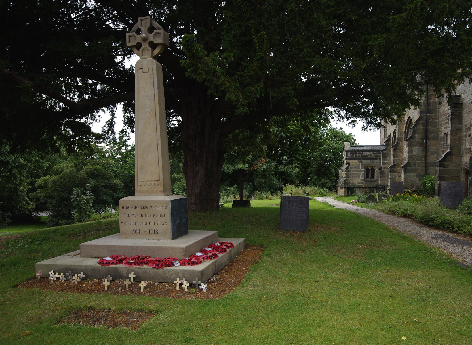 10. BALANCE
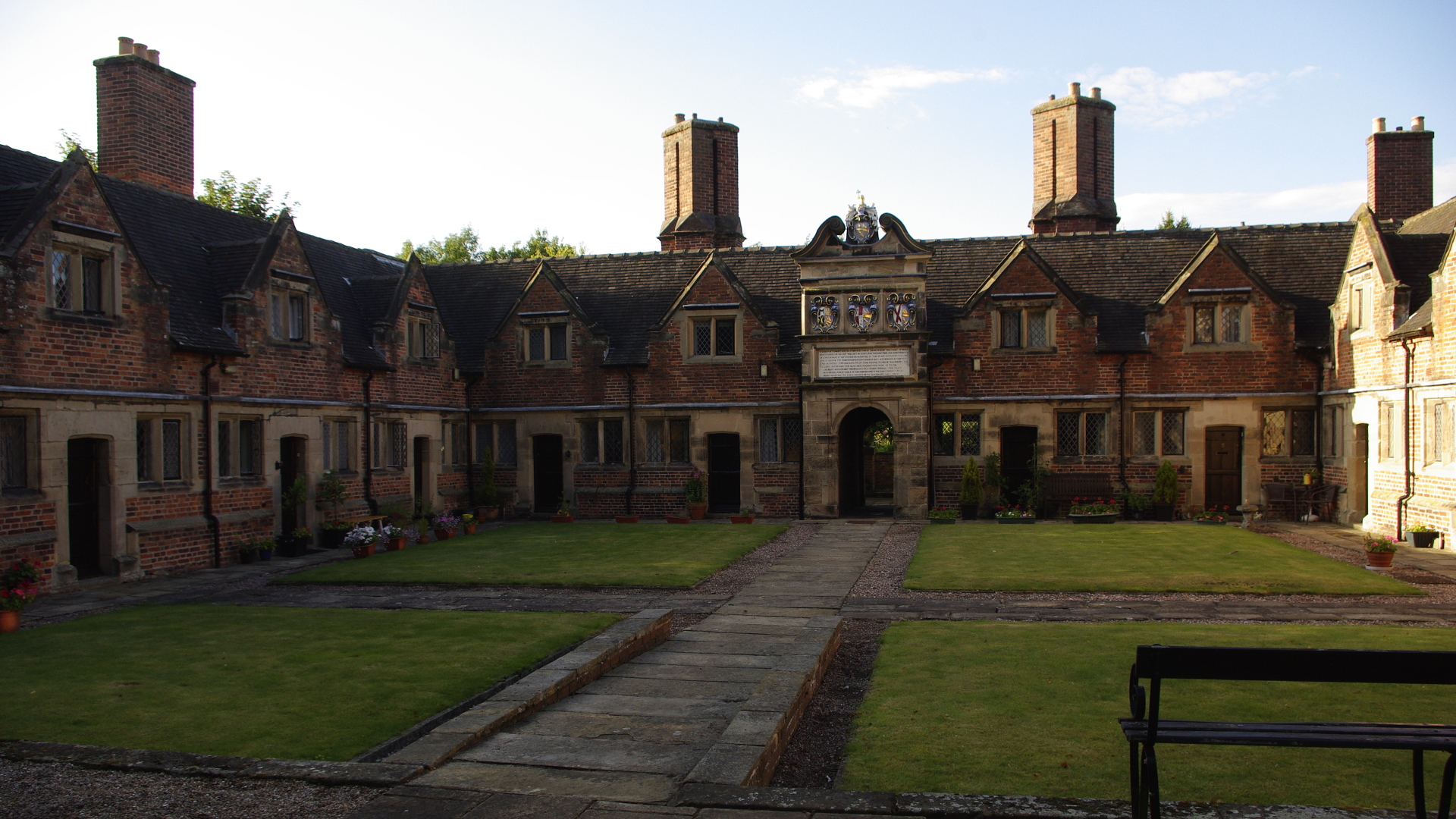
This is possibly the hardest technique to practise (and the most difficult to define) so far. It can be literal, figurative, or both. The idea is to make different parts of the picture, or several items, work together without ‘fighting for space’. Here a theme which incites thought about life and death is built up from the war memorial, the tree, the church, and the graves in the background.
* * *
OK… more soon. Have fun practising!

My Sunday Photo: 22 August 2015
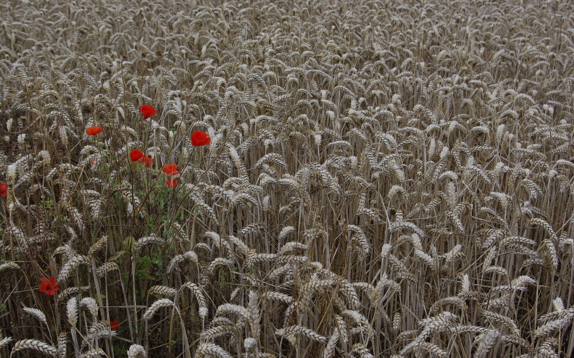 This is one of my recent experiments with ‘negative space’ – that is, allowing a small but important detail in a photo to be set against a large plain (or consistent) background, so as to make a statement. Here, the statement is about late summer; just a handful of poppies in a wheat field about to be harvested. One without the other would not have conveyed the message.